Titan
Design System
Heytitan!
Heytitan App is an interactive search engine for a specific group of products. All products share the same search screen, but each has its own search panel and search result design. And thus, a design system was needed to maintain a coherent experience across existing products and new products that will be added in the future.
All design system elements were planned and designed to be used across the entire product ecosystem, such as the payment system.
■ For more about the platform, check Heytitan🔗 UI design
What Design System?
Titan is a design system as a practice. It started during the UX design stage (a design system as a process) and in parallel of the brand identity creation.
A design system as a practice is integrated within the product design team were both the products, the visual identity, and the system are continuously feeding and influencing each other. It’s iterative and collaborative.
■ Tip: A Design System is good to create and maintain when your product UI is complex, intended for different platforms, or your team require a lot of rapid prototyping.
Atoms
I'm not using the Atomic System terminology (Atoms, Molecules, Organisms) to describe the Design System parts because as Figma became the dominate UI design tools, I see the design process of a design system started to fall into three main parts:
1. Syles: Colors, Fonts, Icons, etc.
2. Components: Buttons, Bars, Toggles, etc.
3. Templates:Pages, Screens, Views, etc
Titan
Here we'll see how all the elements of the design system come together to generate the needed UI for the search screen of each product, and how a simple element in a design system, like a button, is carefully planned and designed to fit every use across the entire product ecosystem.
■ For rapid UI prototyping, components of the design system were pre-prototyped.
1.
Styles
1. Styles /
Colors
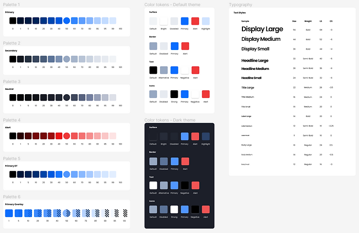
I selected the key colors and their complementary generated tones as a base for the tonal palettes that will guide our main theme.
1. Styles / Colors /
Tonal Palettes
Tonal palettes are the shades and tones around the main color on a scale.The scale can be stretched or narrowed depending on product needs.


► Auto-play Gallery: Titan Design System Tonal Palettes
Palettes are reflected as Figma variables with names that reflect the tonal scale.

Titan Design System - Tones' Variables
1. Styles / Colors /
Color Tokens
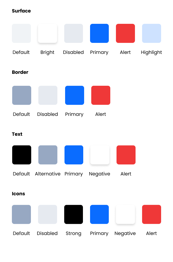
Tones were selected then tested and contrast-checked against the early UI elements for the main and the dark themes.
Winning colors are then tokenised as human-readable values so everyone on the team understand color roles easily.

► Auto-play Gallery: Titan Design System - Themes Palettes
And in this case the colors were tokenised technically as Figma variables that will make color updates very fast and efficient at any time for any design element or elements family.

Titan Design System - Themes' Colors Tokens
■ Tokens are not Figma specific but Design Systems specific.

Tokenising a color
1. Styles / Elements /
Icons
1. Styles / Elements / Icons /
Icon Seed
To use the custom icon set I designed for Heytitan platform in the most efficient way, I made a use of Figma's nested components to have a single icon (placeholder) that can be used by anyone on the team to generate all our product needs.
► Video: Icon Seed in Titan Design System
1. Styles /
Typography
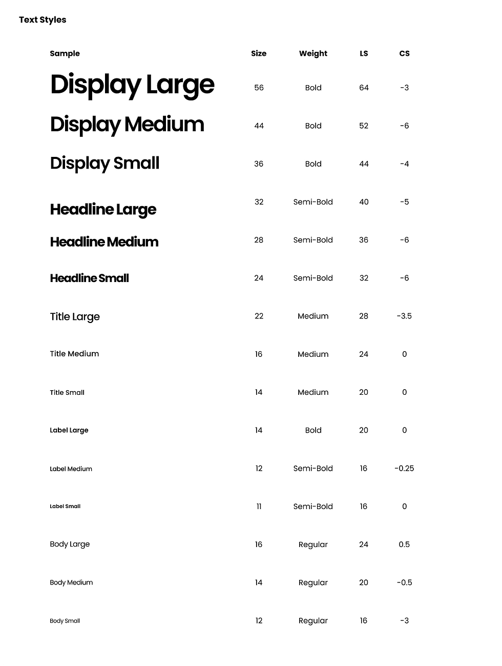
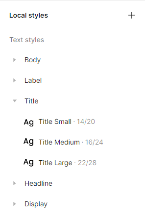
As part of the branding part of the project, Poppins typeface was selected for this project. Poppins if perfect for mobile application for having higher readability and legibility with a lot of weights to fit every need.
I like Google Material way of having three simple sizes of each main text style. For example, Large title, Medium title, and Small title, instead of the classic Headings.
Initial variants were saved as Figma Styles (for the lack of a better way at that time). And they will be revisited and adjusted when each style is applied to the project for the first time.
► Auto-play Gallery: Titan Design System - Text and Figma Styles
1. Styles /
Number System
A scale of 2s is the base of all spacing as the project is mobile platform.
■ As indicated in the Radius scale screenshot here, I don't nest size variables specifically (a scale con tolled by another scale), as going suddenly from a scale of 2s to 3s for example is not realistic probability in my opinion.
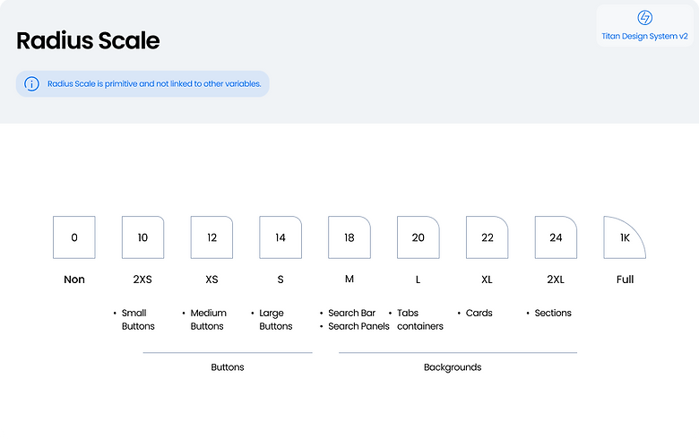
Sourcefile: Titan Design System - Corner radius scale
1. Styles /
Elevation
As shown in the original source file screenshot, elevation doesn't scale up consistently for the lack of any reason to do so, and because we have two different background colors/sections present most of the time (white and grey) and thus stronger shadow properties needed to display against a darker background.
Elevation is used only to highlight the focus states of components.

Sourcefile: Titan Design System - Elevation

2.
Components
A simple text button can be made up using two things (atoms), a text style and a color. A component of a Design System is anything that is made up using the building blocks listed in styles (Colors, Icons, Texts, Effects, and Spaces).
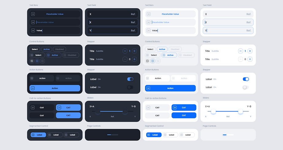
Titan Design System has the following components:
Buttons, Chips, Search Bars, Navigation Bars, Tab Bars, Cards.
Each component is planned, designed, and pre-protoyped (if applicable), and technically varied as Figma Components.
2. Components /
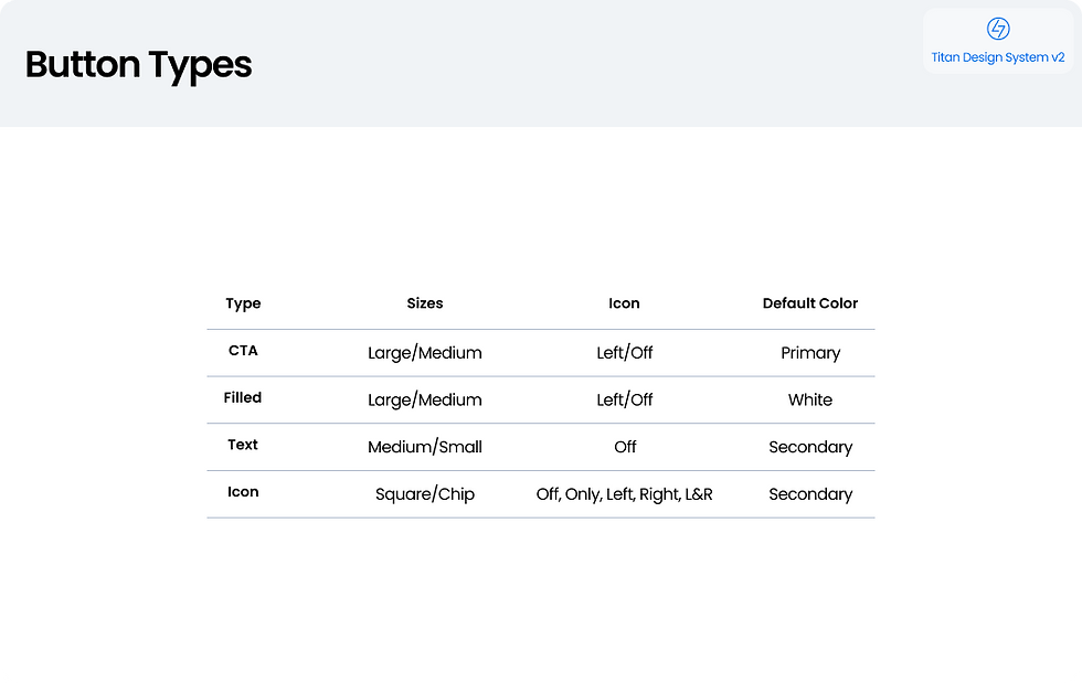
Buttons
In a Design System, a button must be planned, designed, defined as variables, and pre-prototyped.
2. Components / Buttons /
Buttons Planning


► Auto-play Gallery: Titan Design System - Buttons Planing
2. Components / Buttons /
Buttons Design


► Auto-play Gallery: Titan Design System - Buttons Design
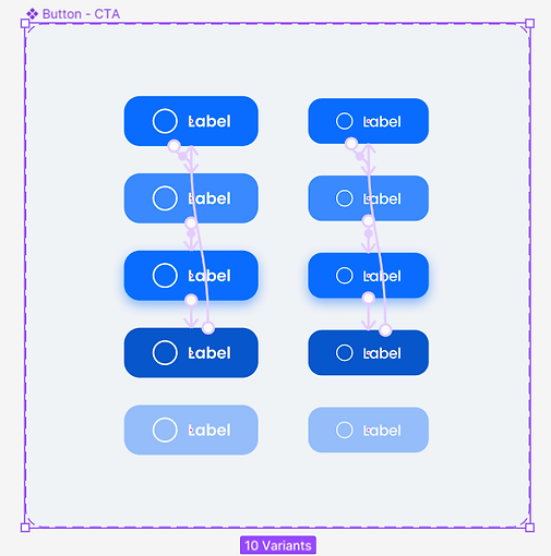
■ Just like we had one icon seed, we can design a single button in Figma that can generate all the buttons we planned. However,that could be too complex for other users of the Design System. Grouping makes rules clearer.
2. Components / Buttons /
Prototype-ready
For rapid prototyping, all buttons' states are pre-prototyped and ready to be implemented in UI prototypes.
Titan Design System - Buttons Design
► Video: Buttons Pre-prototyping

3.
Templates
3. Templates /
Main Screen
And this is not Home screen but the main screen that represents the value proposition of the product.
The main screen in this testing prototype is completely structured using the elements of Styles and Components framed as 'Auto frames' in Figma.

► Video: Main UI prototyping
3. Templates /
Dark Theme
Every element in Styles and Components has a predefined dark theme variants.
The same template above converted to a dark theme in a second using Figma mode.

► Video: Dark theme prototype
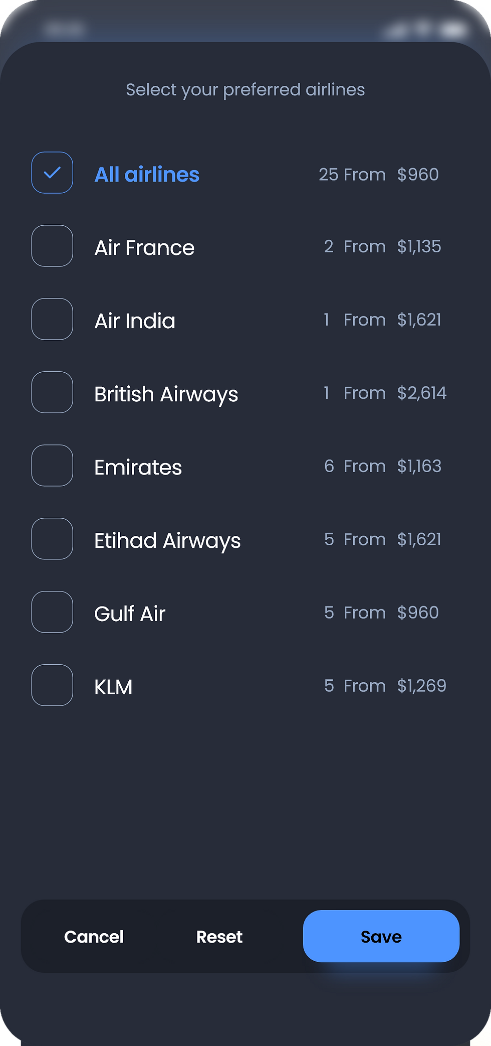
3. Templates /
Popups
Popups play a crucial role of Heytitan user experience.
The following screens are generated using our popup templates. The templates are constructed using additional components, like toggle buttons and range selectors.


► Auto-play Gallery: Titan Design System - Data Inputs