
Heytitan
Meta-search Engine Marketplace
Jan 2022 - May 2022
1. Overview
Product
Heytitan is a mobile meta-search engine and an aggregator for a specific group of products and services that can be added to fiat and cryptocurrency payment plans.
One prominent use case describes Heytitan as a mobile platform for new expats to find and purchase the expensive one-off-purchased products and services needed pre and post-relocating, from booking a flight ticket, to buying and insuring an apartment, to finding schools for the kids.
In term of popular apps in the market, Heytitan can be looked at technically as a combination of products like Google flights, Airbnb, Jerry, and few others.
Adding money wallets and a chat function, Heytian aspires to be a community where new expats can find, discuss, and purchase these products and transfer money within and outside “Titans community”.
Process
The main challenge was to design a simple and unified user experience for all current and future products the app supports since each qualifies to have an independent platform.
To solve the main challenge we started UX processes on these products in parallel in order to find out the ideal use flow for each and then for all together, as possible, while maintaining a balance between familiarity and innovation.
Each UX process informed another and had different priority, research efforts, and timeline. This case study will explain the overall process using examples from the following areas (or modules as the team used to call them):
Product vision, Search function, Flights booking, and Automobile insurance.
Role
I started working on the project after my initial proposal has won a design contest. I was the UX and UI designer on a team comprised of 3 developers, a project manager, and a managing partner.
I was responsible of designing the platform focusing on the most urgent modules in a way that the team can adopt the user flows for new products in the future as independently as possible.
I was also responsible of choosing stock illustrations for Titans characters that will be used in the platform. However I had a lot of fun designing and learning about the Titans characters.
I manged to direct the overall design direction of the project blending all modules into a coherent experience, and plant and nurture a culture of solutions over requirements, by facilitating team exercises aimed to involve everyone in research, testing, and ideating, as this brief case study shows.
2. Discovery
Goals
To spark a UX conversation and inconsequential ideation among the team aimed to sketch and early-validate the current state of product design trinity; a market, a problem, and a product.
Process
We started a WhatsApp group and a series of meetings to discuss everything the team knows and doesn’t know yet about the problems our solution tries to solve and for what people. To support the team conversation, I started limited secondary and primary research to fill the gaps we had.
Output
High-level guidelines articulated in: Business problem, Business goals, Products goals, Users and user Goals, and Risks. Business goals, Products goals, and risks are technical and business specific; direct and indirect financial returns for example.
💡 The starting version of the Business Problem didn’t mention expats or relocation as product vision was under development.
Business Problem
And this is not a UX problem but an exercise in framing product vision into a guideline. Publishing the initial business problem promotes that our product is not only a solution to a problem but could be even more, a response to a change.
The current state of the domain, the change in the world, and the gab we believe we see in the market:
Most popular Meta-search engines, aggregators, and services brokers, like Google flights, Expedia, and Airbnb, have focused mainly on a single product or service, while a significant segment of their target users are in need to other related services simultaneously especially long-stay travelers. And most of their solutions are highly technical and can be lacking on the intimacy in User Experience.
Payments methods in the observed products are limited or limiting and do not accommodate the new high demand of crypto currency payments.
Addressing the market gap:
We will work toward finding a digital solution that enables customers to find and purchase the main services they seek when they relocate or travel. Our initial focus will be to provide for airplane tickets, real estates, hotels booking, and insurance services for health, life, and automobile.
Users goals
Specifying target audiences is absolutely the most important part of a product design. And when asked about what group of users we have in a mind, we got the dreaded “everyone” answer since the product is technically a search engine, but fortunately we also got “Heytitan targets generation Z, travelers, technology enthusiasts, and crypto holder”.
Limited research, both primary and secondary, was done to simply investigate each high-level characteristic about our users, or a cell in the next table, against our business problem.
The following table shows the evolution of the target audience characteristics during the early to mid-stages of the product design first cycle.
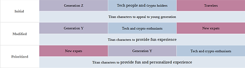
🖱️ Click image to view
Early validation
Early validation is the actual title of this section named “Discovery”. The motivation behind this stage is to answer this simple question: “Do our potential users struggle enough with the problem we think they have in order to buy-in our solution?”.
One example of market (users) validation was the question; “To what degree we are targeting crypto audience?”.
-
Crypto enthusiasts spending enormously on social media represent a minority, while the people who own and have founded these multi-millions-dollars worth projects are spending rather wisely investing in the projects.
-
Crypto enthusiasts are not highly concerned about real-estate investments, or any kind of insurance other than the mandatory car insurance in some countries and states.
-
Crypto enthusiasts use a group of niche applications and websites in terms of interaction and user interfaces.
We carried the crypto discussion into ideation, as we will see later in this case study, and presented a solution that supports crypto enthusiasts rather than specifically targeting them.
3. Research
Goal
Diverge time!
After we specified the characteristics of our users, we need to identify the problems they might have in relation to the services we have in mind in order to shape our product gradually.
Process
We started be a desk-research to inform a primary research that involved usability testing and competitive analysis tools to answer the UX questions we are after.
Output
By the end of research phase, our thinking about our product has changed from a market place to a community, and from a search engine to a platform.

🖱️ Click image to view
3.1. Secondary research
We started by looking into research conducted in the travel, property, and financial industries to build a background about people’s needs and concerns when they relocate to another city or country for a mid to long-term stays in relation to our product.
For more details, this is the relative research reports:
Key findings
We identified the common main needs and topics of concerns. The specifics vary depending on the individual but some common factors were identified:

🖱️ Click image to view
Other findings
Potential expats do have other critical concerns, but it falls out of the scope of our product. For example, “cultural needs” is a critical concern and it’s a common factor in few other critical needs we are currently exploring. But as our product is technically a market place, we will only keep the non-commercial needs in mind as they might apply to commercial features later on, for example, when designing search options.
💡 The omitted needs were reconsidered and adopted after primary research as we will see.
Early use insights
After identifying the main topics, we started to zoom in looking for common users’ goals and pain points when digitally experiencing the services we are considering in order to inform next research.
In flights booking:
Although there were no surprises in the common user goals in online flights booking, such as:
-
Comparing prices to find the cheapest fare.
-
Selecting their preferred airlines.
-
Choosing a convenient departure and arrival time.
However, the insights uncovered about users pain points were more helpful, such as:
-
Confusing booking processes or user interfaces, including technical issues and errors.
-
Occasional frustration with additional fees or charges
-
Occasional frustration with unexpected changes to their flight route.
In online car insurance:
Overall, users want a simple, affordable, and personalized experience when insuring their cars online, with transparency and trust in the insurance company and reliable customer service especially during claiming process.
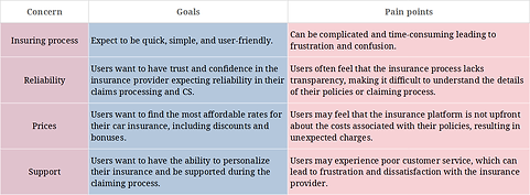
🖱️ Click image to view
3.2. Usability testing
Having learned a bit more about the subjects, the team has joined to shortlist our direct competitors. In car insurance, we ended up with Progressive, Geico, Protect, Allstate, StateFarm, and Jerry app.
Auto Insurance
Test Day
The products we have tested require US based users for a complete experience. In the short window we had, we were able to recruit two people from the US that fit our target users group and who are looking to buy their first car in that same year.
We asked each user to visit a group of three of the most popular car insurance websites in the US to find an insurance for the car they have in mind.
The tests were ran remotely where each participant shared their computer screen via a Skype video call. Participants were instructed to use computers in order to eliminate the negative effect of a bad responsive website design on the test results.
Test Results
The following table summarize the shared findings between the products. Other important shared user behaviors were recorded such as navigation loops that will directly influence navigation patterns in wireframing.
At the end of test the participants were asked to rate their experience on each website using five stars scale. The ‘Why” after that uncovered the most important details.
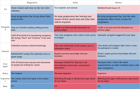
🖱️ Click image to view
3.3. Competitive analysis
The team has shortlisted our direct competitors in flight booking as: Expedia, Kayak, Google Flights, and Skyscanner.
Goal
-
Find and understand user goals and obstacles in relation to similar product. (Informs UX design, Research)
-
Understand the common use flow of similar product to maintain a degree of familiarity in usability. (Informs UX design, Usability)
-
Find what operational problems similar platform commonly face in order to avoid having them. (Informs software development)
Affinity mapping
Adhering to our schedule, we relied on the user reviews posted on Google Play to gather insights related to user goals and pain points, other questions, and the occasional interesting and counter-intuitive insight that most of the time come in a form of an emoji!
We analyzed few hundreds of the most recent user reviews for Expedia mobile app on Google Play.
Making sense of the ambiguity:
AI-generated world cloud shows the most frequently mentioned words in the user reviews. Sometimes it can help identify the most common themes and concerns among users. Well, not this time.

🖱️ Click image to zoom in
Keywords frequency:
However, looking into specific issues we learned from earlier research, we created a bar chart to show the percentage frequency to identify hot topics. Hot topics are investigated further for in-depth insights.
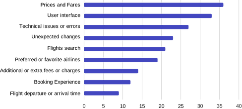
UX Insights:
Prices and fares: 20% of the users mentioned that they were satisfied with the prices and fares offered by the airline, while 12% expressed dissatisfaction with the high prices.
Preferred or favorite airlines: 18% of the users mentioned their preferred airlines, citing factors such as reliability, customer service, and loyalty programs.
Booking process and user interface: 16% of the users had issues with the booking process, citing difficulties in navigating the website, slow page load times, or confusing user interface.
Unexpected changes: 15% of the users experienced unexpected changes such as flight delays, cancellations, or rescheduling, which caused inconvenience and frustration.
Booking tickets: 14% of the users had issues with booking tickets, such as availability, difficulty in changing or canceling reservations, or unclear refund policies.
Flights search: 12% of the users had issues with the flights search feature, such as difficulty in finding desired flights or filtering options.
Flight departure or arrival time: 12% of the users had issues with flight departure or arrival times, such as early morning or late-night flights, long layovers, or delays.
Additional or extra fees or charges: 10% of the users expressed frustration with additional or extra fees and charges, such as baggage fees, seat selection fees, or in-flight purchases.
Technical issues or errors: 8% of the users experienced technical issues or errors while booking, such as payment processing errors or website crashes.
💡 Percentages don’t carry on from stage to another depending on how specific the investigative question is.
Zoom in:
Each insight was inspected further in different times in the design process when needed.
Unexpected charges: About 28% of users mentioned unexpected charges as a pain point or negative experience in their reviews:
-
The most common types of unexpected charges mentioned were baggage fees, seat selection fees, and change/cancellation fees.
-
Some users mentioned that they felt the unexpected charges were excessive or unfair.
-
A few users mentioned that they were not clearly informed about the charges before booking or during the booking process, leading to frustration or surprise.
-
Some users suggested that the app could benefit from more transparency around fees and charges, or more flexibility in adjusting bookings without additional fees.
Booking process: Around 23% of the comments mention the booking process or booking experience, which indicates that this is an important aspect of the flight booking experience for users.
-
Some users find the booking process to be smooth and easy, while others express frustration with various aspects of the process, such as confusing interfaces, long loading times, or errors during payment.
-
Some users mention specific features or options that they would like to see improved or added to the booking process, such as more flexible cancellation policies or the ability to easily book multi-city trips.
-
Overall, the booking process seems to be a significant pain point for some users, and improving this aspect of the flight booking experience could lead to increased satisfaction and loyalty.
4.1. Proto-Persoan
Proto-personas can be crafted at the very beginning. They are based on what we know and what we need to know and validate so far. They are meant to be updated after each discovery until become the “untouchable” users personas.
We have created 1 or 2 personas for each module. Each persona was created with the help of the team member who participated in the relevant research or user testing.
In this example, Alexis persona was created with the help of the project manager who participated in the usability test of Google Flights mobile website.
Personas pop in frequently in any design process and discussion and it can generate more perspectives, such as problems statements and how-might-we-s.
Problem Statement
How might we create a personalized flight booking experience for Alexis, allowing them to easily find the best deals and their preferred airlines, while minimizing the overwhelming number of options presented to them?
How might we?
How might we create a personalized flight booking experience for Alexis, allowing them to easily find the best deals and their preferred airlines, while minimizing the overwhelming number of options presented to them?

4.2. User journey maps
We created visual narratives that depicts each persona journey while digitally experiencing each module we are working on, in order to further understand our users motivations, moving from identifying pain points to specifying them, and look for opportunities that inform the ideation sessions.
Flight booking
The following mapping is for our persona Alexis experiencing online flight booking. The journey ends with Alexis leaving an aggregator mobile application to continue the booking process on an airline website.

4.3. User flows
Starting with a simple task flow (of; Home, Search “my flight”, “my flight” Search results, “a flight” info page), we created easily-readable flowcharts (generally consists of only actions and processes) that count for every “click” and interaction.
After discussed with, primarily, the development team and iterated, flowcharts were the primary source for wireframing.
User flows in all formats create awareness of how to optimize or generate a design work with a better user experience. “Wire flows” were the base of UI design, and later, “screen flows” helped communicating the design to the entire team.
Flight booking
The following mapping is for our persona Alexis experiencing online flight booking. The journey ends with Alexis leaving an aggregator mobile application to continue the booking process on an airline website.

5.1. Social money transfer
Official social communities of low ranked crypto projects are more alive and active than top 10 projects.
In our research in crypto communities on social media platforms, we found that casual money transfer inside these communities is one of the most attractive features.
Since we are having our own crypto and fiat wallets, we generated several ideas regarding casual social money transfer and games for our Titans community, in addition to the official money transfer.

💡 Screenshots from official crypto communities on Telegram and Discord mobile apps.

5.2. Titan contacts
During user research, we observed that users tend to consult friends about some search results
I proposed and sketched an edgy idea about making the whole product a dedicated chat app where you can chat with your friends about products and bring Titan into the conversation anytime to assist you and show your friend what are you talking about; by typing a recognized syntax or simply a dedicated emoji.
Since we didn’t have the time for a user interview campaign to identify the degree of that need, I simplified sharing search results instead. A search results card can be shared as-it-is directly to in-app contacts, most recent conversation, and social media easily.
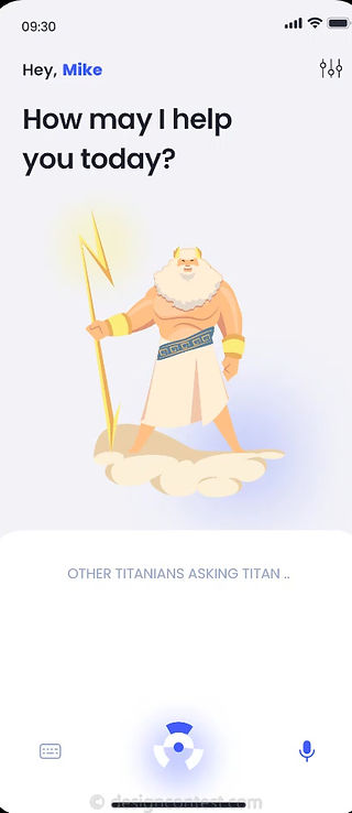
5.3. Personal assistant
At that point it seemed natural to explore framing the product into a personal assistant.
This video preview starts by showing users trendy searches in order to familiarize them with the evolving capabilities of the app. Then it shows the user initiating a similar voice search after saying the hot phrase "Heytitan".
And it features the new logo I proposed that hopefully looks to you as a titan helmet, a bullseye, and a little robot!

Illustrations
Illustrations of the Titans of Atlantis and Mount Olympus .
6.1. Wireframing
In order to maximize creativity, Wireframes were not direct or verbatim translations of the user flows. Instead, everyone on the team has shared UI ideas, concepts, or hand drawn sketches.
Influenced directly by users’ navigation patterns in user testing, sketches were grouped under two main UI patterns and transormed into high fidelity wireframes.

💡 A sketched idea by the director manager on "Titan ID" that will be used for tagging users and in-app money transfer.
UI Pattern 1
The first pattern is for products where users tend to go back and forth between search results and search parameters frequently, such as flights module.

UI Pattern 2
The second is a wizard-based UI pattern for products that require a big amount of user input that is unlikely to be changed in regard of quantity and type, such as car insurance module.
At this point, this UI pattern is planned to implement automatic transition between wizard screens, as this feature was very successful in user testing during research.

6.2. Prototype
Hi-fi prototypes were based on the hi-fi wireframes and each UI element is directly based on an element in the user flows and journey maps.
Prototypes for the same functions were tested by the same usability testing participants and iterated.

UI Pattern 1
The first UI pattern is directly based the user flow showed earlier where users can easily interact with all search parameters and search results at the same time.
Search options: As we saw in research, users may feel frustrated if they cannot find the flight they are looking for due to limited search options, such as filters or sorting options:
-
Clear Search panel that appears/disappears by a slight swipe.
-
Search parameters are sectioned into primary and modifiers.
-
Gives the user the option to initiate a new search or modify the current search from the same screen.
Search results: As we learned, a cluttered or confusing interface can make it difficult for users to find the information they need and can lead to frustration. And if the search results take too long to load, users may become impatient and move on to another service provider:
-
Result section is clear and can occupy the entire screen easily.
-
Cards display all and only the most needed relevant information.
-
Sponsored contents are displayed relevantly and ergonomically.
UI Pattern 2
This prototype shows the second UI pattern where users need to provide several groups of data.
Usability testing:
In the usability tests conducted during research, we found that automatic navigation between web pages was a hit and we were planning to implement it. However, during this usability test we found that the same users seemed a bit confused when the next page appeared after they have made a data selection/input, as it was unexpected at all.
Replacing automatic navigation be manual [Next] and [Back] buttons gave users the time to be more confident about the data selection they made.
We didn’t notice any difference after removing the [Back] button keeping only [Next/Continue] button as users have intuitively used the pagination navigation bar successfully to go back to a specific screen when needed and to review all their input before the final [Submit/Search].
💡 This was an early prototype, the use of emojis here was a part of a different experiment.


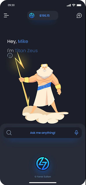
Home screen
I designed Home screen with the absence of on-boarding in mind. Search trends and suggestions inform users on the ideal syntax and the categories our young algorithm supports.
Wallet
Unlike our Titans, mortals' memory is funny. I don't recommend this layout for a wallet that supports several currencies (7+).
But since Heytitan is starting with one fiat and couple of crypto currencies, this UI pattern was designed to provide fun and impressive experience for our young crypto and tech audience.


Flash menu
To highlight the payment services, keep the conversation open, and maximize accessibility while trying to impress our target users, the following functions will be accessible from anywhere within one click and one second:
🔎 Access all search features.
💸 Transfer money in your default currency.
💰 Deposit money in your default currency.
💬 Pickup your conversation where you left.
👍🏾 Long press to initiate fingerprint scanner to unlock wallet.