
Ember Fund
Mobile App Redesign
Nov 2021
Project Overview
Details:
App Name: Ember Fund
Purpose: Crypto Currency Investment Management.
Client: Ember, USA.
Industry: DeFi, Fintech.
Platform: iOS.
Target Market: High-net-worth investors, USA.
Design Tools:
-
Adobe XD for UI design and Prototyping.
-
Adobe Illustrator for icons design.
About:
Ember Fund provide easy and accessible investment in curated crypto portfolios designed and managed by industry experts, hedge funds, and quantitative analysts.
Task:
"Redesign Ember Fund app identifying and solving current UI flaws while maintaining brand colors and feel into minimalist, tech-forward yet playful vibe. Think Apple but with a bit more personality."

► Video: Home Screen
Research Overview
Users:
We researched existing and potential users, focusing on high-net-worth individuals (HNWI) to understand their goals, pain points, and preferences when managing their crypto portfolios. The users groups we found are:
-
Passive Investors who prefer a hands-off approach with expert guidance.
-
Active Investors who seek timely insights and actively trade.
-
High-Risk Takers versus Conservative Investors.
We uncovered that HNWIs:
-
Value expert advice.
-
Need quick access to liquidity.
-
Rely on relevant and timely information to make decisions.
Competitors:
We looked at wealth management services, banking apps, and investment platforms targeted at wealthy investors in both crypto and finance sectors, likethe Fidelity App, Robinhood, and Coinbase Pro.
We studied features that appeal to high-net-worth users, such as personalized recommendations, real-time financial overviews, and market insights in order to identify what is working well in these apps and what might be missing in terms of supporting crypto-specific needs.
Highlighted Features:
-
Wealth management apps suggest investment portfolios for diversified investments.
-
Crypto investment services emphasizing buying power as a key financial metric for liquidity management.
-
Noticing the importance of news feeds for financial decision-making in competitor apps.
User Journey Mapping
Approach
Creating detailed user journey maps to understand how investors interact with the app, from opening it to making investment decisions.
Mapping out user flows for common tasks, such as buying new assets, checking available funds, and responding to market changes.
Decision Impact:
Users want all critical information on one screen to make quick, informed decisions with minimal effort.
Based on trust, presenting suggested investments saves time for users who want quick, expert-driven investment opportunities.
Including a buying power overview ensures that users have the liquidity information they need without leaving the main screen, streamlining the process.
The need for up-to-date market news is identified as essential for making informed investment decisions, so it's placed prominently to fit into the flow of daily use.
User Journey Map 1
Making Investment Decisions
1. Entry Point / Home Screen:
User Action:
The user opens the app and lands on the home screen.
Touchpoints:
-
Buying Power Overview prominently displayed.
-
Suggested investments (portfolio cards) shown based on their investment preferences.
-
News Feed displaying relevant market updates and opportunities.
Pain Point Resolved:
Wealthy investors can immediately see how much capital they can deploy, review expert-recommended portfolios, and stay up-to-date with real-time market information.
Goal:
Understand available funds and investment options within seconds.
Design Evaluation
Home Screen
Strengths
Clarity of Information:
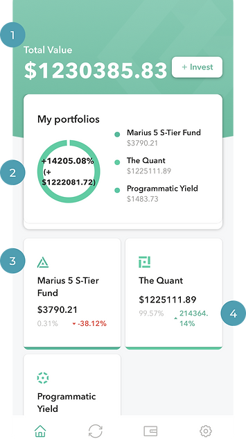
The design communicates the total value of the user's investment at a glance, which is crucial for users to quickly assess their portfolio's performance. (1)
The individual portfolio names (Marius, Quant, Yield) are clearly listed with their respective values, making it easy for users to see where their investments are allocated. (3)
Portfolio Overview:
The graph providing the overall performance percentage (+14%) and total fiat value is a useful visual aid, giving users an immediate sense of how their entire portfolio is doing. (2)
Detailed Performance:
Showing the performance of each portfolio in terms of both dollar amount and percentage change is helpful. Users can see not just how much they have in each portfolio, but also how each one is performing. (4)
Ember Fund Home Screen
Weaknesses
Visual Hierarchy:
While the total value is prominent, the circular graph may take up more space than necessary. We could consider reducing its size or moving it to make room for more detailed information, or other functionalities (e.g., shortcuts to trade or re-balance portfolios). (1)
Highlighting Important Data:
The performance percentages of individual portfolios (like +10% or -10%) could be more visually distinct. For instance, using more prominent color coding for the cards (green for gains, red for losses) might make them stand out better. (2)
User Actions:
The design doesn't currently provide clear action points or buttons, such as options to buy/sell assets or view detailed portfolio performance. Including buttons like "Trade," "Re-balance," or "Details" next to each portfolio could make the home screen more functional. (3)
Space Utilization:
The design uses a significant amount of space for simple data presentation. Depending on the target user base, we need to consider including additional information or features. (4)
Personalization:
Allowing users to customize which portfolios or performance metrics they see first could improve the user experience, catering to individual preferences. (2)

Ember Fund Home Screen
Redesign Wireframe
Home Screen
Interactive Elements & Call-To-Action:
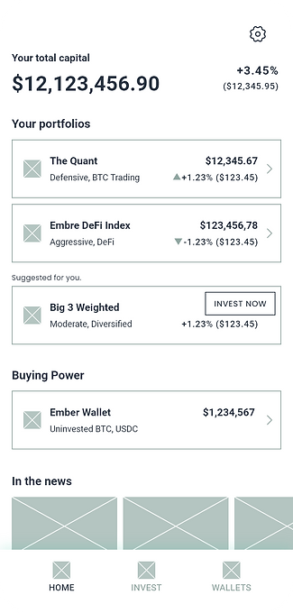
Ensure that users can interact with the portfolio names or percentages to view more detailed data. (1)
Active Approach & Personalization:
Suggested portfolio card is introduced based on passive investors' preference for expert recommendations. (2)
Financial Overview & Management:
Buying power is added to meet the need for liquidity awareness among active investors. (3)
Market Awareness & Exclusivity:
The news section addresses the desire for up-to-date, relevant market information to capitalize on opportunities. (4)
Home Screen Wireframe

Support
Personal
Rebranding
Professional
Trust
Comfort

Circle of life
Ember, ash, mud, to bud. Brand palette and message are adjusted and re-conceptualized.
Brand palette, typography, and visual elemnts adjusted and re-conceptualized.
UI Design
Home Screen

Portfolio Screen
Settings

Splash & Animation